How I Make More Meaningful Art: Finding Freedom in Restrictions.


I’ve recently acquired a new Pinterest board in my ‘Reference & Inspiration’ section: color palettes.
Naturally, I use color in a way that reflects my mood, current favorite color combos, or more or less in a way that is not structured. While using color in this way has been fine, I was starting to feel stagnant in my art-making process. Without really taking notice of my browsing tendencies on Pinterest, I realized I had collected quite a few color palettes that I was inspired by.
But what to do with all that inspiration?
I decided to put some parameters around the next couple of pieces I would create. Specifically, pick a color palette and a reference photo and then give it a go in my sketchbook. I did give myself the grace and leeway to change a color (if I didn’t have it or because it wouldn’t work for the piece) and I could pick a color not in the palette if I felt the piece needed it.
Piece #1: Basket of Tomatoes


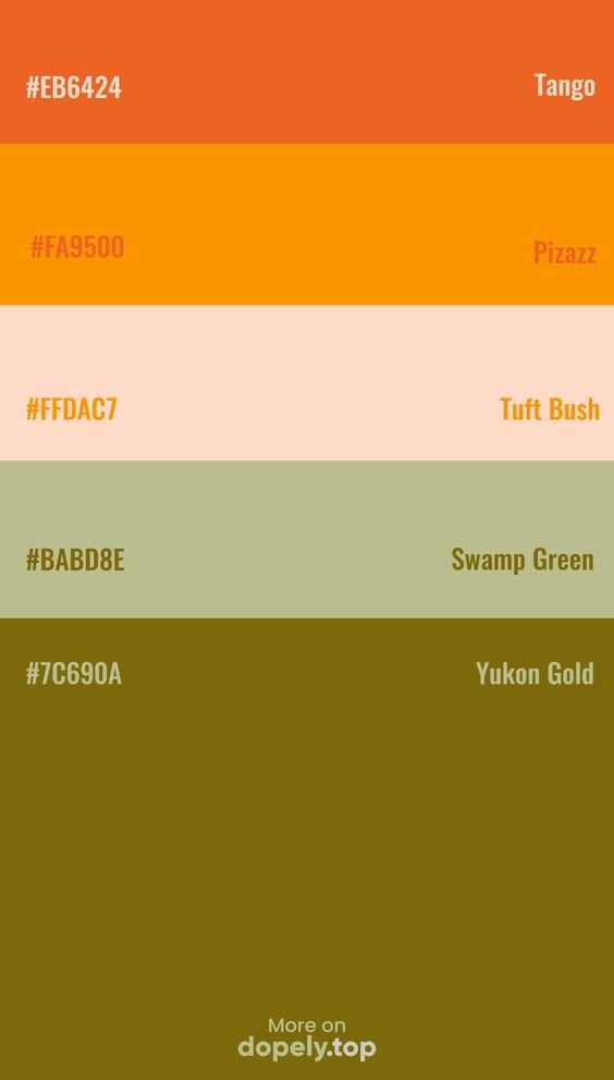
I couldn’t find the creator of this color scheme, unfortunately. What drew me to this palette is that it features colors I already use, just muted.
I created this piece using alcohol markers and neo-color pastel crayons. I lined it with a green Pentel pen. I don’t like using black so I opted out for a dark brown instead, and I added a pop of color with the single red tomato at the bottom. What’s interesting about this piece is that it’s not in a style I normally make. It reminds me of an old ’70s poster, and I like the look of the solid color with no shading or highlights. I don’t think I would have created something like this if I didn’t force myself to stick to certain colors.

A bigger view 🍅
Piece #2: Swan Lake
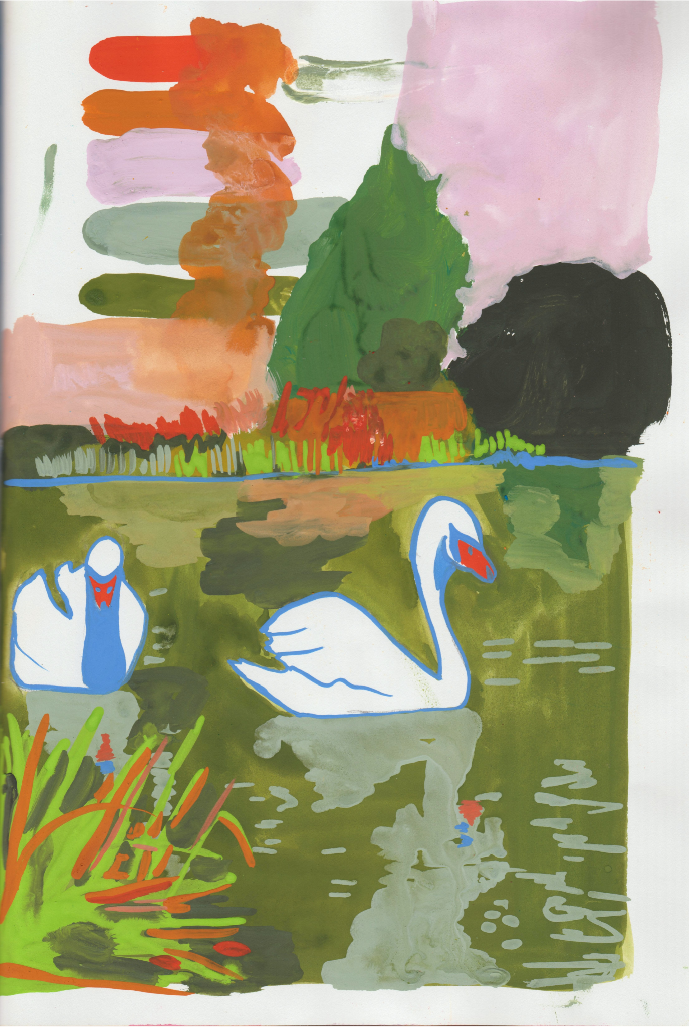
This color palette was made by Dopley Colors. I did include blue because I wanted to outline the swans and I think the blue complimented their orange beaks. I loved how the dark green looked like pond water and the sage green for the swans’ reflection. If I could do things differently I would try and match the pink better, mine ended up more on the purple side.

A close-up of the swatched color palette.
A close up 🦢
Piece #3 & #4: Pilea Plant & Orange Tree
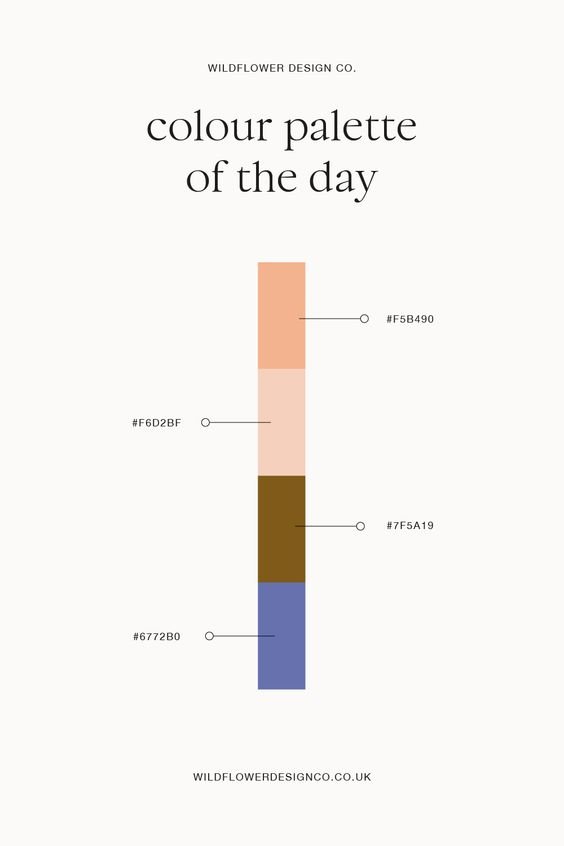
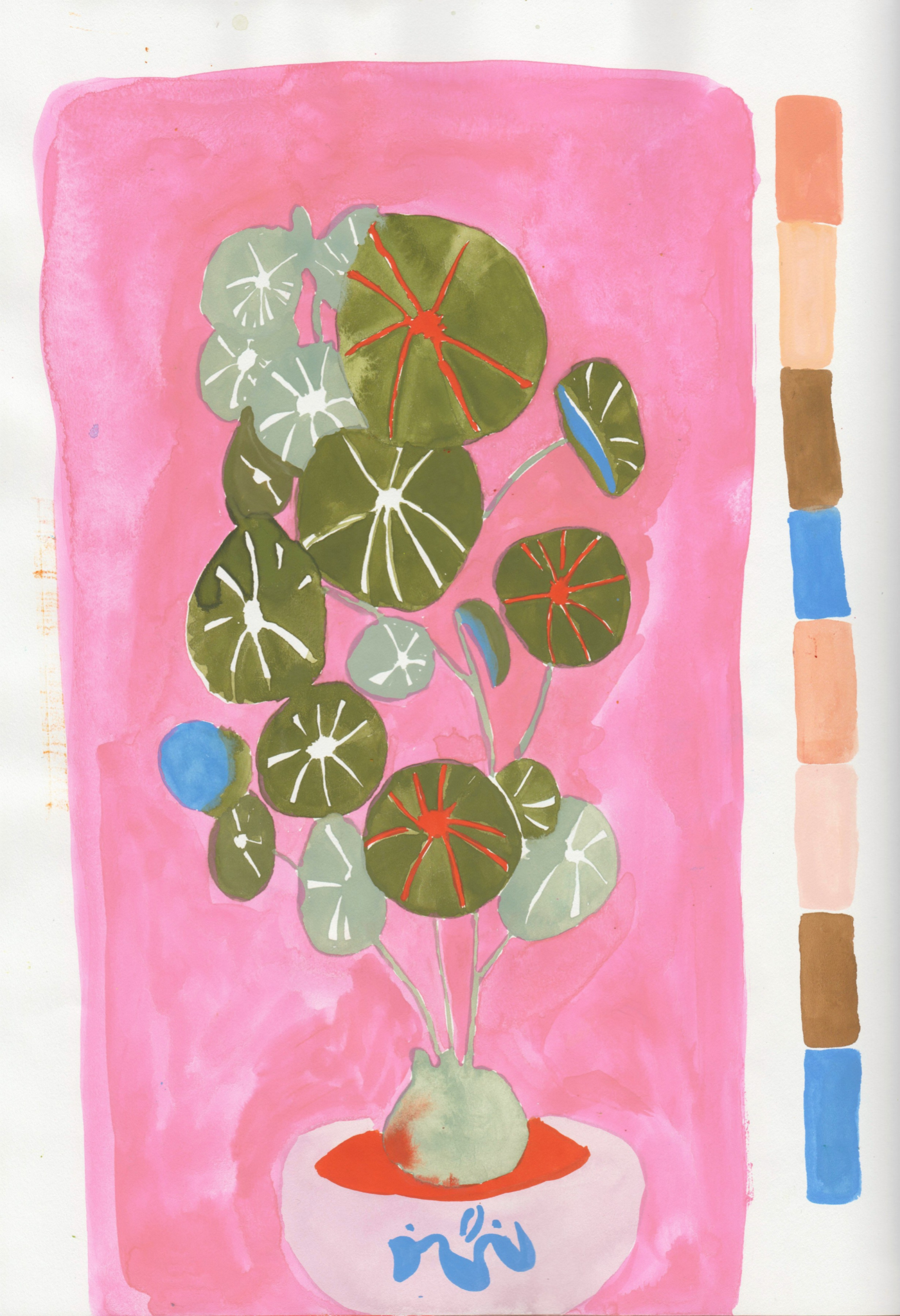
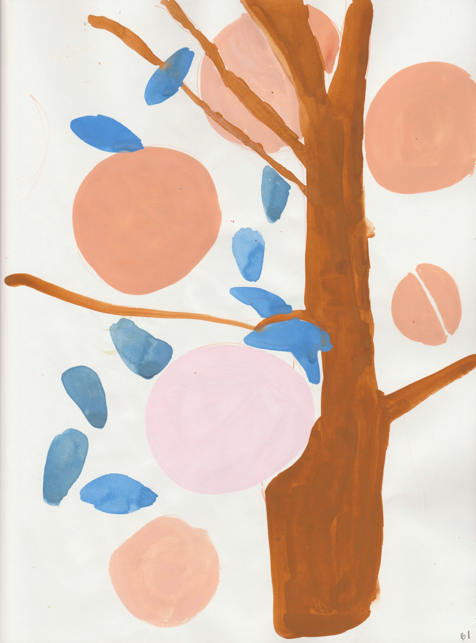
This color palette was created by Wildflower Design Co. This palette had the least amount of colors and was the most challenging one.
The piece on the right, the “orange” tree, stayed true to the 4 colors from the scheme and I never finished it. I think I felt overwhelmed trying to make all the leaves blue, but not make it look like a big blue blob. For the pilea plant on the left, I included two different shades of green, bright pink, and neon orange. I liked how this piece turned out so much that I made it February’s sticker for my patrons.


What I learned from this experience:
Creating restrictions creates freedom. When I self-impose purposeful restrictions, such as a color palette, it pushes me to creatively problem solve and makes my time more meaningful rather than having any color I want to use available.
I noticed that when I gave myself one less decision to make, it jump-started the art-making process.
It was okay to add or take away colors, and I used the palettes mostly as a starting point, not a strict rule.
I was able to create art faster.
It deepened my appreciation of paint in general and made me practice color mixing.
Challenges you make for yourself are fun!! Do them more often!!